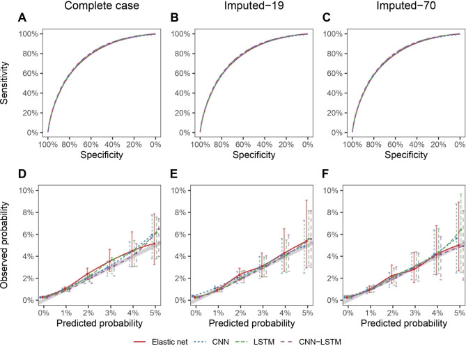
Fig. 3.
Predictive performances of the elastic net, CNN, LSTM and LSTM-CNN models. Discrimination is represented by the ROC curve (upper figures), and calibration is represented by a smoothed calibration plot showing the observed probabilities (and 95% confidence intervals) according to predicted probabilities (lower figures). The thick gray line shows values expected for a perfect calibration, with observed probabilities equal to predicted probabilities. All estimates are averaged over the 10 repeated 5-fold cross-validation datasets and over the imputed datasets for the Imputed-19 and Imputed-70 cohorts

