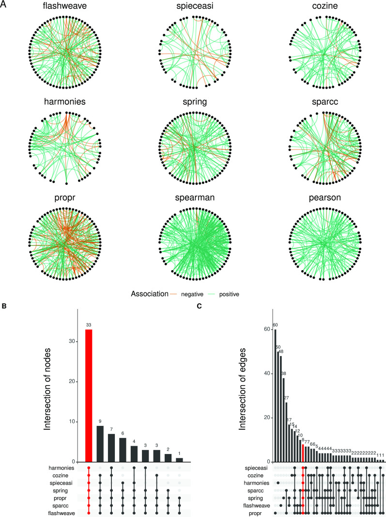
Fig 4.
Networks generated using different network inference methods show notable differences in terms of edge-density and connectivity. (A) The nine different networks generated by the different network inference methods (excluding mLDM). The nodes for each network (representing taxa) are arranged in the same positions in a circular layout, and the differences in the connections can be directly visualized and compared. The green links are positive associations, and the orange links represent negative associations. The networks look dissimilar and vary widely in terms of connectivity, and it is notable that the correlation-based methods generally produce networks with higher edge-densities. A threshold of 0.3 was set for the correlation-based methods (sparcc, propr, spearman, and pearson), and a threshold of 0.01 was set for the direct association methods (flashweave, spieceasi, cozine, harmonies, and spring). (B) The node overlap Upset plot indicates that all the networks have a large proportion of common nodes involved in connections (33 out of 68). Conversely (C), the edge overlap Upset plot shows that a very small fraction of these connections are actually shared (8 out of 202). The data used in this analysis were the healthy stool samples from the FMT data set. mLDM is not shown in the comparisons because the algorithm failed to converge for the particular network combination used here (default setting of the MiCoNE pipeline).

