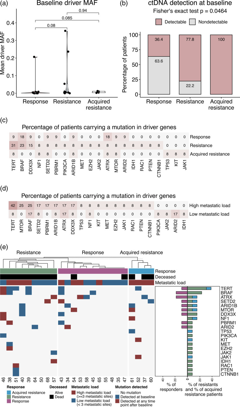
Fig. 2.
Mutation analysis. (a) Violinplots showing the mutant allele frequency at baseline. Values shown on the Y-axis are calculated by taking the mean MAF overall filtered variants per patient. X-axis and color show response category. (b) Stacked bar plots showing the percentage of patients per response category where ctDNA was detected at baseline. X-axis shows response category, Y-axis displays patient percentage, color corresponds to the detection status at baseline. (c) Heatmap showing the percentage of patients carrying mutations in panel genes. The percentages are calculated within categories. Color intensity corresponds to the percentage values. (d) Heatmap showing the percentage of patients carrying mutations in panel genes, split according to metastatic load categories. Visualization follows panel (c). (e) Heatmap-barplots showing the driver mutation profile of the cohort. Blue tiles indicate that a mutation was detected at baseline, red tiles indicate mutations that were not found at baseline but were detected at a later time point. Top annotations show patient characteristics: response category (pink: response, green: resistance, blue: acquired resistance), survival status (gray: alive, black: dead), and metastatic load (blue: low, <3 metastatic sites, red: high, ≥3 metastatic sites). Barplots on the side show the percentage of patients carrying a driver mutation per response category (pink: response, green: resistance, blue: acquired resistance). ctDNA, circulating tumor DNA; MAF, mutant allele frequency.

