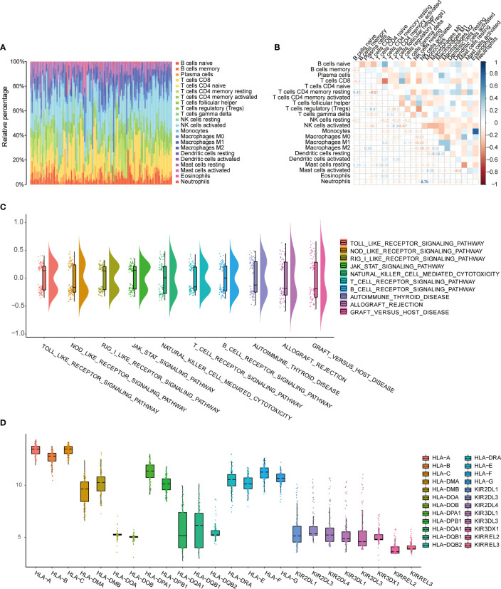
Figure 2.
Evaluation of immune cell infiltration and immune correlation analysis. (A) Barplot shows the proportion of 22 types of immune cells in endometriosis samples. The column of the graph is sample. (B) Correlation heat map of 22 immune cell infiltrates; Blue represents positive, red represents negative. The depth of the color indicates the strength of the correlation. (C) Changes in enrichment of 10 immune-related pathways. (D) Expression differences of HLA and KIR family genes.

