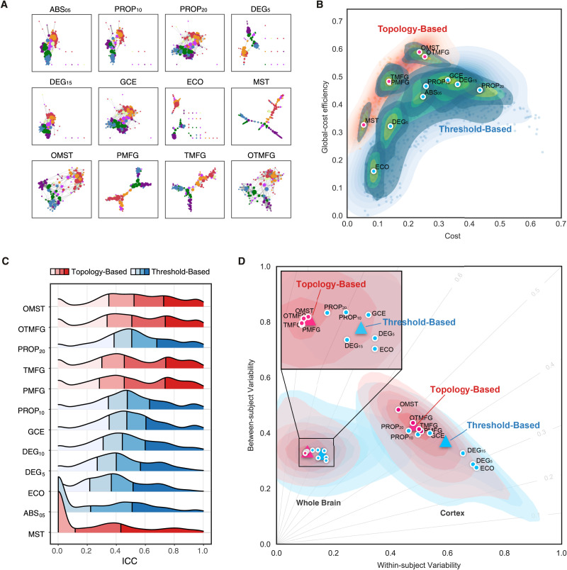
Figure 4. .
Edge filtering schemes and their networking performance. (A) Twelve schemes of filtering edge are applied to an individual connectivity matrix, resulting in the 12 brain networks with their nodes colored as the Yeo2011-7Networks (Thomas Yeo et al., 2011). (B) Global cost efficiency are plotted against network wiring costs of all the brain networks derived with the 12 edge filtering schemes from all the individual rfMRI scans. Red dots represent the topology-based, while blue dots are for threshold-based networks. These dot plots are fitted into the topographic (contour) maps where the local maxima for each filtering choice is labeled as a circle. (C) Density plots are for ICC distributions under various the 12 edge filtering schemes. These density distributions are ranked from top to bottom according to decreases of the mean ICCs, while the two colors depict the topology-based and threshold-based schemes. Four quartiles were indicated by vertical lines. (D) Network measurements are projected onto the reliability anatomy plane coordinated by both between- and within-subject variability. Red dots represent the topology-based, while blue dots are for threshold-based networks. The topographic (contour) maps fit the dots and label the local maxima as a circle for each scheme and the global maxima as a triangle for the topology and threshold groups, respectively.

