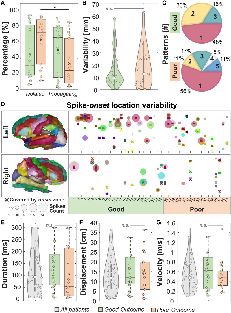
Figure 2.
Descriptive features. (A) Percentages of isolated and propagating events in good versus poor outcome patients. (B) Variability of spike onset(s) from the onset zone. (C) Predominant spike onset(s) number for good versus poor outcome patients. (D) Spike onset location variability per patient, separated per right and left hemisphere. Each cross represents an anatomical area covered by the onset zone while the circle is an area covered by a predominant spike onset. The dimension of the circle represents the number of events originating from that area. (E) Duration, (F) spatial displacement and (G) velocity of spike propagation for all patients. In all the panels, the black line identifies a comparison with P < 0.05 via paired sign-rank test and the grey line identifies a non-significant (n.s.) rank-sum test. In the box plots, the cross identifies the mean value, the line is the median, the lower and upper edges are, respectively, the 25th and 75th percentiles, while the whiskers range from the minimum to the maximum values (disregarding the outliers).

