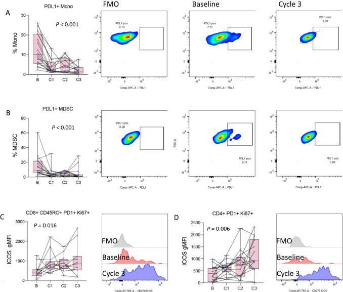
Fig. 4. Changes in PBMCs during therapy.
A Changes in the frequency of PDL1 positive monocytes at baseline and after each of the first 3 cycles of atezolizumab (n = 19, 19, 17, 16 patients at baseline, C1–C3). The left panel is a box and whisker plot where each dot represents the value for an individual patient, the line represents the median, the box represents the interquartile range, and the whiskers represent the spread of the data. The overlayed line graph demonstrates the trend for the individual patients across cycles. The right panel is representative flow cytometry staining for an individual patient at baseline and after cycle 3, as well as the fluorescence minus one (FMO) negative gating control. B Changes in the frequency of PDL1 positive myeloid-derived suppressor cells (MDSC) at baseline and after each of the first 3 cycles of atezolizumab atezolizumab (n = 19, 19, 17, 16 patients at baseline, C1–C3). The left panel is a box and whisker plot representing the median, interquartile range, and data spread with an overlayed line graph demonstrating the trend for the individual patients across cycles. C Changes in the mean fluorescence intensity (MFI) of ICOS on PD1/Ki67 double positive memory CD8 T cells at baseline and after each of the first 3 cycles of atezolizumab atezolizumab (n = 14, 17, 13, 11 patients at baseline, C1–C3). The left panel is a box and whisker plot representing the median, interquartile range, and data spread with an overlayed line graph demonstrating the trend for the individual patients across cycles. Error bars represent the spread of the data. The right panel is a representative flow cytometry histogram for an individual patient at baseline and after cycle 3, as well as the corresponding FMO negative gating control. D Changes in the MFI of ICOS on PD1/Ki67 double positive CD4 T cells at baseline and after each of the first 3 cycles of atezolizumab (n = 18, 18, 16, 14 patients at baseline, C1–C3). The left panel is a box and whisker plot representing the median, interquartile range, and data spread with an overlayed line graph demonstrating the trend for the individual patients across cycles. Statistical comparisons across the course of therapy were performed by ANOVA. Source data are provided as a Source Data file.

