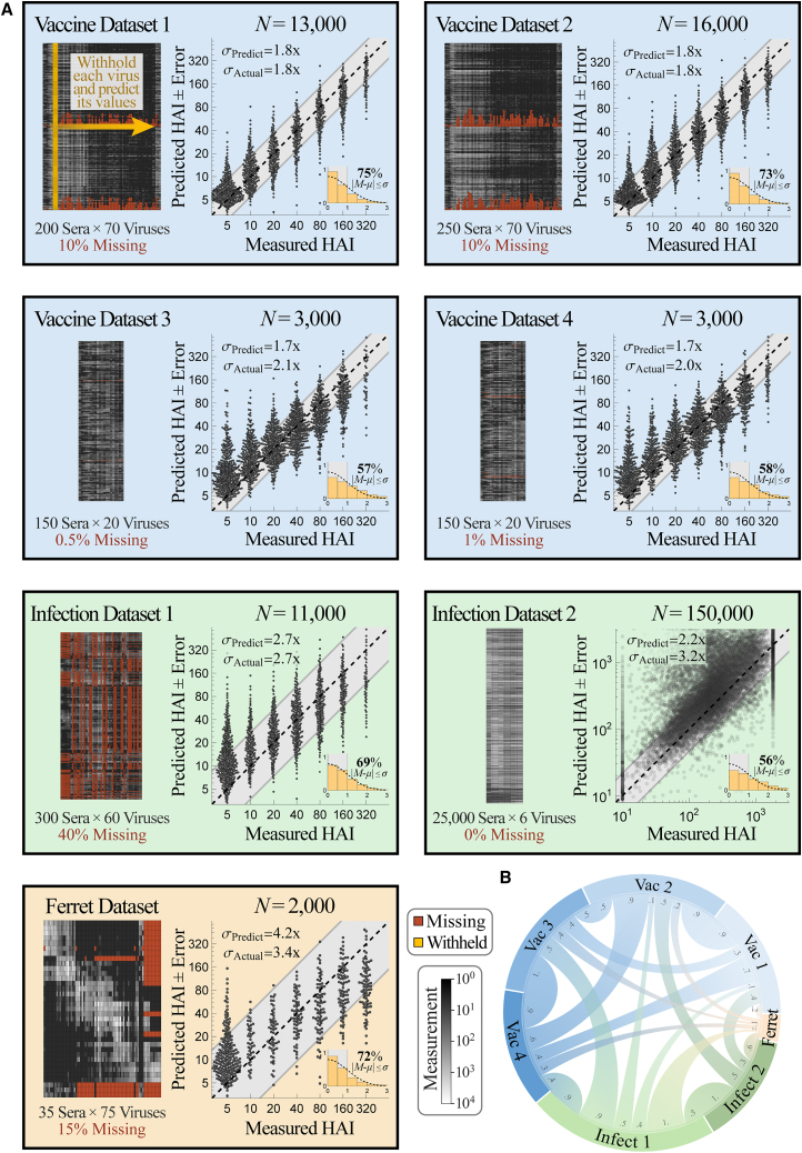
Figure 4.
Validating prediction ± error quantification across 200,000 measurements
(A) We combined seven influenza datasets spanning human vaccination studies (blue boxes), human infection studies (green), and a ferret infection study (orange). Each virus in every dataset was withheld and predicted using the remaining data (shown schematically in gold in the top left box). We display each dataset (left; missing values in dark red and measurements in grayscale) and the collective predictions for all viruses in that dataset (right; gray diagonal bands show the average predicted error σPredict). The total number of predictions N from each dataset is shown above the scatterplots; when this number of points is too great to show, we subsampled each distribution evenly while maintaining its shape. The inset at the bottom right of each plot shows the probability density function (PDF) histogram of error measurements (y axis) that were within 0.5σ, 1.0σ, 1.5σ… (x-axis) compared with a standard folded Gaussian distribution (black curve). The fraction of predictions within 1.0σ is explicitly written and can be compared with the expected 68% for a standard folded Gaussian.
(B) Chord diagram representing the transferability between datasets. For each arc connecting dataset X→Y, transferability is shown near the outer circle of Y, with larger width representing greater transferability (Figures S1 and S4; STAR Methods).

