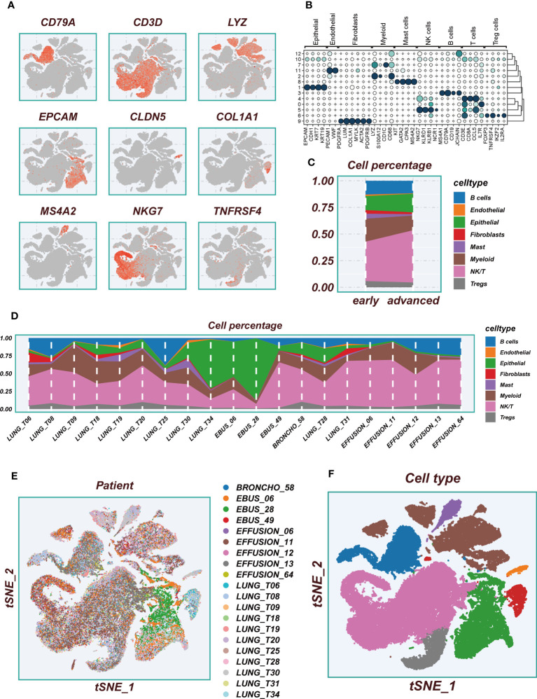
Figure 2.
Flow chart of single cell analysis. (A) Multiple tSNE plots showing the expression of classic cell type marker genes. (B) Bubble plots showing the expression of marker genes corresponding to each cluster. (C) A histogram of the percentage of cellular components showing the changes in the proportion of different cellular subpopulations at early and advanced LUAD. (D) A histogram showing the variation of cell proportions between different samples. (E) A tSNE plot showing the distribution of cell samples from different LUAD tissues. (F) A tSNE plot demonstrating the distribution of different cell types.

