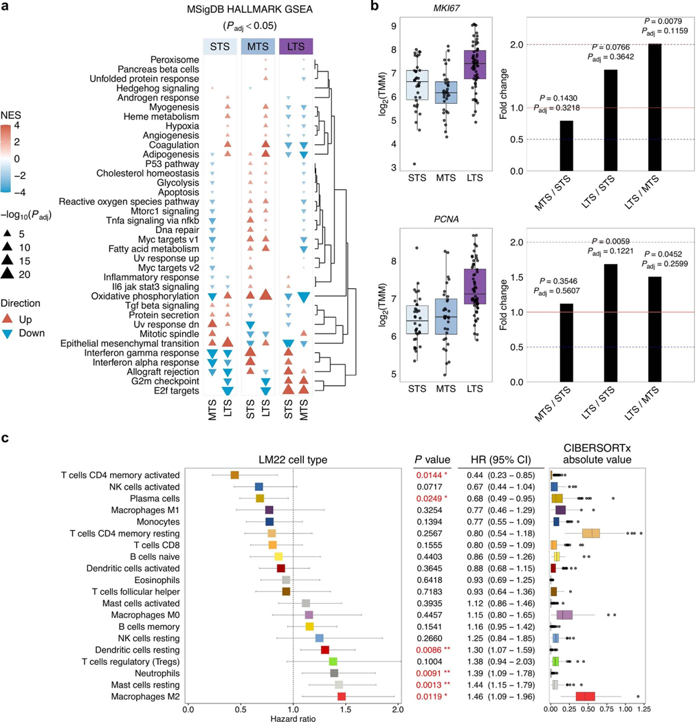
Extended Data Fig. 7: Transcriptional phenotypes in long-term survivors.
a, Clustered heatmap summarizing gene set enrichment analysis (GSEA) using the hallmark Molecular Signatures Database (MSigDB) gene sets. Direction and color of triangles relate to the normalized enrichment score (NES) as generated by FGSEA. P values (two-sided) were calculated using the FGSEA default Monte Carlo method; the size of the triangles corresponds to the negative log10 Benjamini-Hochberg adjusted P value (Padj). The columns are split by survival groups (STS, short-term survivor; MTS, moderate-term survivor; LTS, long-term survivor), with the direction of enrichment denoted by the group in the heading (numerator) versus the two other groups labeled below. b, Boxplots summarize expression of MKI67 and PCNA proliferation gene markers across the survival groups (left; STS n = 34, MTS n = 32, LTS n = 60); points represent each sample, boxes show the interquartile range (25–75th percentiles), central lines indicate the median, and whiskers show the smallest/largest values within 1.5 times the interquartile range. Differential expression analysis was performed using DESeq2 to determine fold change (right) of gene expression between survival groups (two-tailed Wald test, both unadjusted P values and Benjamini-Hochberg adjusted P values (Padj) are shown). c, Forest plot (left) indicates the hazard ratio (HR, squares) and 95% confidence interval (CI; whiskers) for overall survival calculated using a univariate Cox proportional hazard regression model based on the LM22 immune cell types detected by CIBERSORTx analysis (n = 126 patients). Cell types are arranged by HR. P values < 0.05 are colored red (*P < 0.05, **P < 0.01) and were not adjusted for multiple comparisons. Absolute enrichment scores per cell type across the cohort are shown in boxplots (right); boxes show the interquartile range (25–75th percentiles), central lines indicate the median, whiskers show the smallest/largest values within 1.5 times the interquartile range and values outside it are shown as individual data points.

