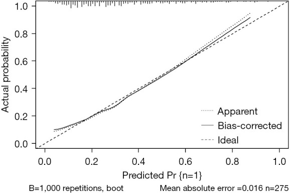
Figure 3.

Calibration curve of the nomogram model in the study cohort is depicted. The benchmark curve manifests as a straight line traversing the origin of the coordinate axis. A nomogram’s predictive capability improves as its calibrated prediction curve approaches the benchmark curve. ‘Bias-corrected’ refers to the curve after correction, while ‘Ideal’ represents the benchmark curve. The graphical predicted and observed values align closely, suggesting that the nomogram model in this study exhibits solid calibration.
