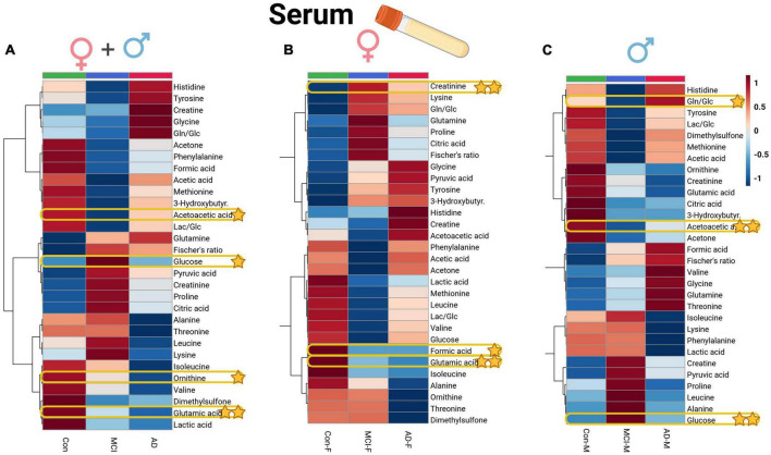
FIGURE 4.
Heatmap overview plots [(A)–whole cohort, (B) female participants, (C) male participants] of the serum averaged levels of metabolites between the three groups – Alzheimer’s disease, controls and mild cognitive impairment (AD; n = 26, Con; n = 29, MCI; n = 21) in the serum cohort: Each line represents a concentration change (from + 1 to –1, scaled) from the three-groups average reading. Also, each line is clustered together with other lines that were exhibiting a similar pattern in concentration changes. The Ward clustering allows to put together metabolites that displayed a similarity in averaged group changes, that could be used later in the data interpretation. In this figure, it is possible to highlight several clusters, where an averaged sample concentration was the highest. Each box is representing a group mean value in a form of color gradient (red – high concentration, blue – low concentration). AD, Alzheimer’s disease; MCI, mild cognitive impairment; Con, control subjects. Significance levels: *p ≤ 0.05, **p ≤ 0.01.

