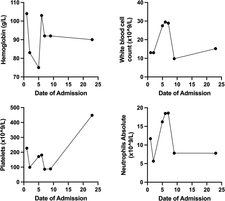
Figure 1.
The patient’s day of admission is plotted on the x-axis, and the components of the complete blood cell count are plotted on the y-axis. The corresponding units are denoted in the y-axis of each panel. The line graph shows the trend of each component throughout the patient’s course of disease.

