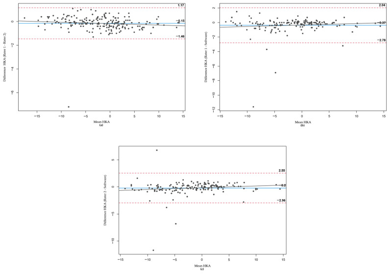
Figure 4.
Bland–Altman plots for HKA measurements. (a–c) represent the comparisons between Rater 1 and Rater 2, Rater 1 and the software, and Rater 2 and the software, respectively. Each plot features the mean values on the X-axis and the differences on the Y-axis, with the pointed lines indicating the 95% confidence interval.

