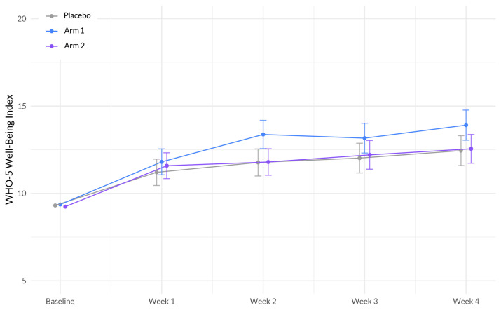
Figure 6.
Evolution of WHO well-being scores between the three arms during the study period x. The plot illustrates the interaction between treatment (Sleep A; Arm 1 and Sleep B; Arm 2) and week on the well-being scale, based on a linear mixed-effects model. The x-axis represents the weeks of the study, while the y-axis represents the outcome scale. The lines represent the trajectories of well-being for each treatment arm over time. The plot highlights the nature of treatment effects on well-being as captured by the linear mixed-effects model, allowing for the incorporation of random effects and accounting for within-subject correlations.

