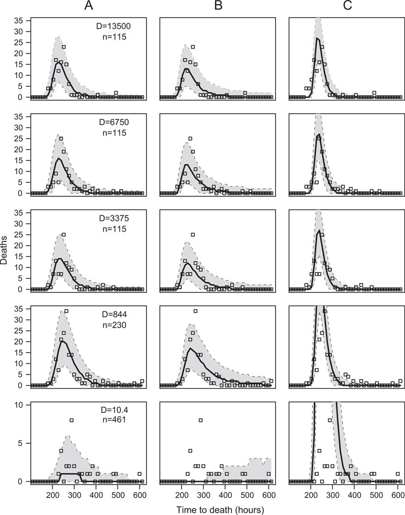
Figure 4:
The fit of our models to the data. Each column shows the fit of a different model. A corresponds to the linear virus growth model (M2), which is the overall best model. B corresponds to the no-demographic-stochasticity model (M7). C corresponds to the Shortley birth-death model (M3). Each row shows a different virus dose D. To make model predictions, we sampled 105 parameter sets from the joint posterior distribution of the parameters, and we used each parameter set to simulate a set of response times. The median value of the number dying in each time bin is plotted as a solid black line, and the 99% envelope is encompassed by the dotted lines. The open squares are the data. The symbol D indicates the applied virus dose, and n is the number of exposed larvae.

