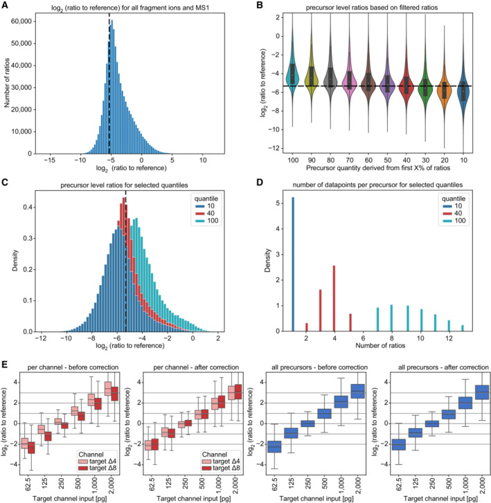
Figure EV4. Ratios to reference channel evaluation and channel correction comparison.

- Ratios to the reference for all available ions (fragment ions and MS1 peaks, scBenchmark dataset), revealing a distribution that has a mode proximate to the expected ground truth (dashed line). The distribution is asymmetric with a skew towards less extreme ratios. A potential explanation for this skew is that noise or interferences are dominant for a fraction of the ratios (a ratio of 0 might be a ‘noise vs. noise’ comparison).
- An approach to mitigate this asymmetry is to filter out some ions before estimating the precursor level ratio. For this, the ratios of a precursor are sorted ascending and only the first ratios are retained (up to the ‘X value’ indicated) using the scBenchmark dataset. The precursor ratio is estimated by taking the mean of the remaining ratios. We see that retaining 40% of the ratios matches the ground truth well and is more symmetric (technical replicates, n = 5). The violin plot shows the distribution of the data while the box depicts the interquartile range with the central band representing the median value of the dataset. The whiskers represent the furthest datapoint within 1.5 times the interquartile range (IQR).
- A more detailed comparison of the distributions when taking 10%, or 40% of ratios as compared to all ratios.
- Number of available ratios per precursor after filtering. We see that in general between 7 and 14 ratios are available, which reduces to 2–5 when taking the 40% quantile.
- Channel correction comparison in scQuant dataset in comparison of all precursor and target channel (technical replicates, n = 5). Ratio of reference channel to target channel was calculated using RefQuant. All log2 ratios were normalized to the single‐cell equivalent sample in the target channel (250 pg). A basic median normalization between the channels was applied. The violin plot shows the distribution of the data while the box depicts the interquartile range with the central band representing the median value of the dataset. The whiskers represent the furthest datapoint within 1.5 times the interquartile range (IQR).
