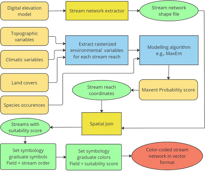
Figure 1.
Geoprocessing workflow to extract and display classified stream networks with suitability scores as attribute table in ArcGIS Pro. The brown colored round-edged rectangles represent spatial data as inputs for different stages of the workflow. The yellow rectangles and green ellipses represent geoprocessing tools and their outputs, respectively. Blue rectangles show part of the workflow outside ArcGIS Pro (in R, Python, and other standalone programs e.g., MaxEnt GUI). The green rectangles are different steps in setting symbology (color-coding) for displaying final output. The red rectangles represent outputs that are being used as inputs, whereas the red ellipse represents the classified streams.

