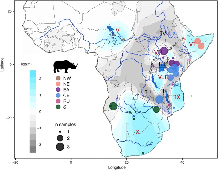
Fig. 4.
Effective migration across the historic range of the black rhinoceros and summary of the inferred historic population structure. The effective migration surface was inferred with EEMS (Petkova et al. 2016) based on genome-wide data from 53 georeferenced historic samples. The color gradient represents effective migration rates in logarithmic scale; blue shades indicate rates higher than average, while gray shades represent migration rates lower than average. The six inferred historic populations were mapped onto the migration surface to determine their geographical distribution. Roman numerals denote regions of low (I–IV) and high (V–X) migration described in the text. Dot size represents the number of samples from each location.

