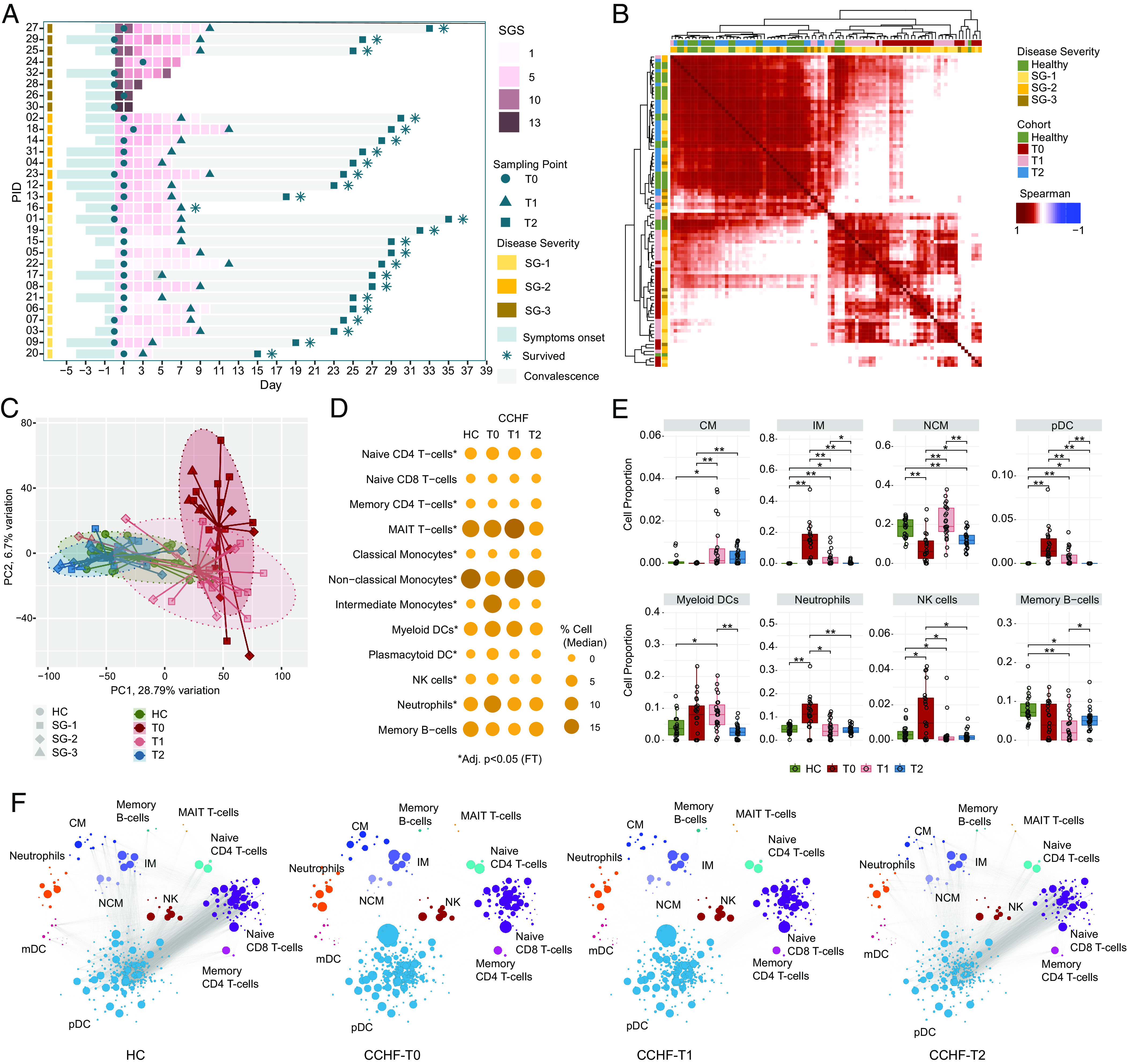
Fig. 1.

Temporal CCHFV pathogenesis and immune profiling: (A) Swimmer plot showing patient sampling information, including clinical features SGS, SG, and sampling time points. x axes represent days in the hospital, day 0 denotes the day of hospitalization, and y axes represent patient IDs ordered according to SG. (B) Patient-to-patient Spearman's correlation matrix clustering. The heatmap shows correlation coefficients computed using scaled TPM values of the top 5,000 varying genes based on median absolute deviation [HC (n = 22), T0 (n = 22), T1 (n = 23), T2 (n = 24)]. All correlations were highly significant (adjusted P < 0.0001) due to the high number of features used. Column and row annotations represent the patient cohort and disease severity group. (C) PCA plot visualizes the sample distribution. PCA was created using the scaled TPM values of top 5,000 varying genes based on the median absolute deviation. Ellipses represent 90% confidence space for each cohort, and point shapes correspond to the severity group. Centroid points of each cohort are computed and connected to each sample in the respective cohort with lines. (D) Bubble graph representing DCQ results. Bubble size and color gradient are relative to the median percentage of cell proportion estimated in each cohort. Asterisks represent a significant change in individual cell population from T0 to T2 by Friedman's test (adjusted P < 0.05). (E) Blood immune cell proportion using DCQ. Boxplot of DCQ results showing comparison among the four cohorts. Asterisks represent a significant change (adjusted P < 0.05) in the Mann–Whitney U test. (F) Network visualization of significant Spearman association (adjusted P < 0.001) between marker genes of cell types estimated in Fig. 1D in cohort HC, T0, T1, and T2, respectively. Bubble size corresponds to the mean TPM value. Nodes and edges represent marker genes of corresponding cell type and Spearman association, respectively.
