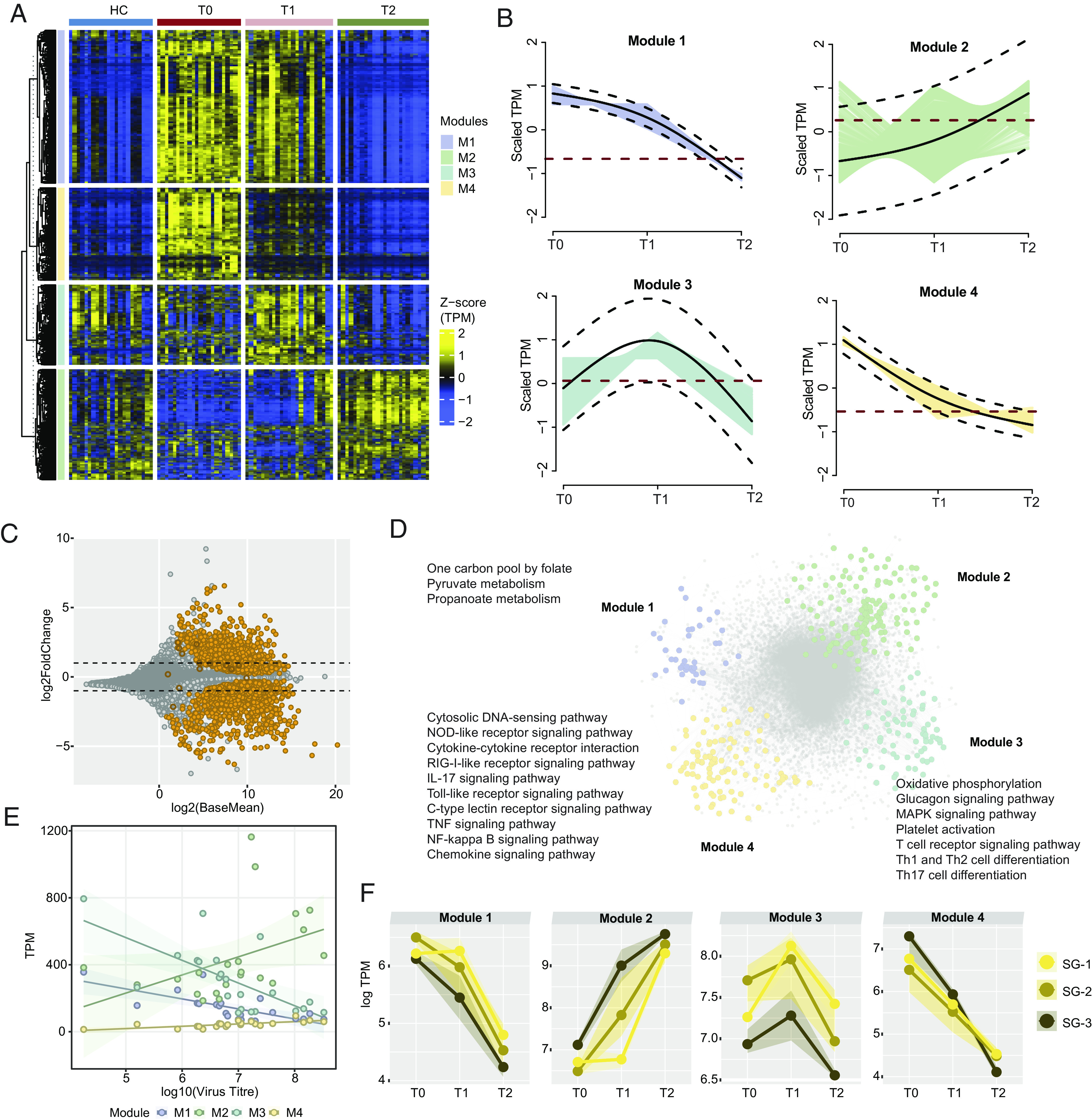
Fig. 2.

Immuno-metabolic trajectories of CCHFV-pathogenesis. (A) Heatmap of genes identified as significantly changing (adjusted P < 0.001) among the three times of infection [T0 (n = 21), T1 (n = 21), T2 (n = 21)] using likelihood ratio test. The heatmap shows TPM transformed and z-scaled expression values of the genes. Column annotation represents the cohorts, and row annotation represents four gene expression trajectory pattern modules computed using the TMixClust algorithm. (B) Modules identified using the TMixClust algorithm. Each module represents a specific trajectory of gene expression. The red dotted line denotes the mean scaled expression value of genes belonging to the corresponding module in a healthy state. (C) MA plot of DGE analysis between T0 and T2. Orange-colored circles denote genes visualized in Fig. 2A. Empty circles denote nonsignificant expression (adjusted P > 0.05). (D) Network of significant Spearman correlation (adjusted P < 0.001) at T0 between and among genes of each module shown in Fig. 2A and their first neighbors. Gray-colored nodes denote the first neighbor genes. Significantly enriched pathways (adjusted P < 0.05) are labeled beside corresponding modules. (E) Spearman association between virus titer and average expression of genes of each trajectory module shown in Fig. 2A. (F) Severity group-specific expression dynamics of each module genes over the three time points of infection. Average expression (log TPM) values of each module for each severity group are plotted on the y axis. The shaded region represents the second and third quartiles of expression.
