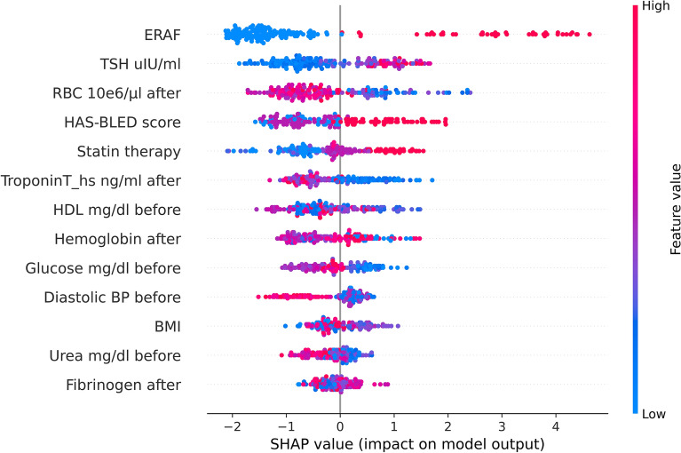
Figure 2.
The SHAP summary plot from the XGB classifier shows the ranking of the top-most contributing features. The positive contribution towards that class is shown on the positive side of the X-axis (representing positive SHAP values), while the negative side of the axis represents a negative contribution or the contribution of those features against the prediction of that class. The XGBoost model, data samples and running examples in the Python programming language are available through the GitHub platform (https://github.com/kasiakaczmarek/predicting-late-recurrence-of-atrial-fibrillation).

