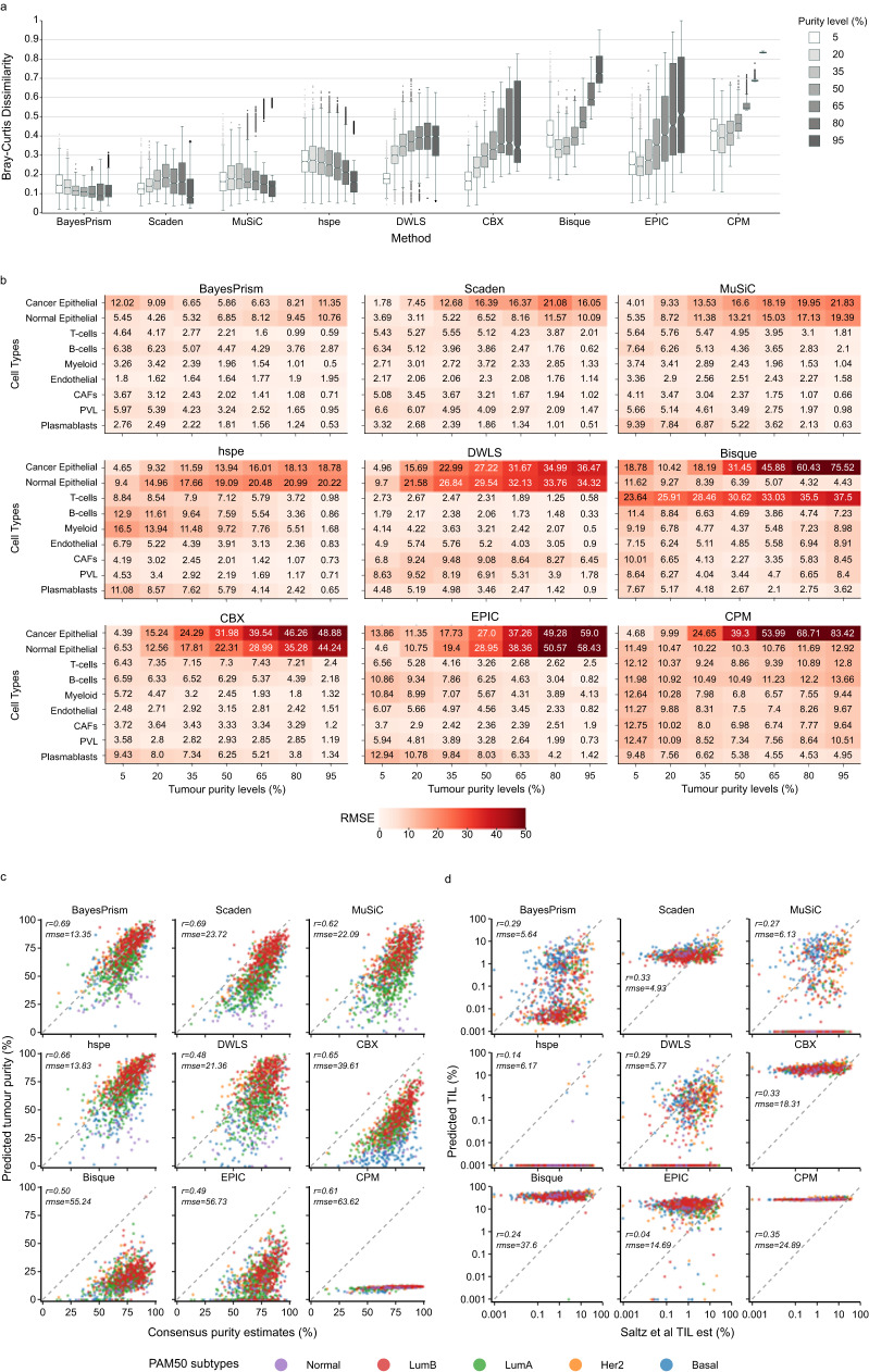
Fig. 2. Impact of variable tumour purity on deconvolution.
a Bray-Curtis dissimilarity between predicted and ground truth cell compositions across 7 tumours purity levels (from 5% to 95%, 15% interval). Deconvolution methods are organised in order of decreasing performance based on their median Bray-Curtis dissimilarity values. n = 2000 artificial bulk at each purity level. Each box represents the middle 50% of Bray-Curtis values, which includes the first quartile (Q1), the median, and the third quartile (Q3). Upper and lower whiskers depict maxima and minima of Bray-Curtis values, excluding outliers. Outliers are Bray-Curtis values that are more than 1.5x the interquartile range from either Q1 or Q3. Higher Bray-Curtis dissimilarity indicates poorer performance. b Median RMSE between predicted and actual cell compositions, aggregated by cell type. Seven tumour purity levels are shown (from 5% to 95%, 15% interval). Darker shade of red represents higher RMSE values and poorer performance, with numeric RMSE values shown. Major cell types (y-axis) are organised into three categories: epithelial (normal epithelial and cancer epithelial), immune (T-cells, B-cells and myeloid), and stromal cells (endothelial, CAFs, PVL and plasmablasts). CAFs: Cancer Associated Fibroblasts, PVL: Perivascular-like, RMSE: Root Mean Square Error. Scatter plots of predicted tumour purity (cancer epithelial proportions, y-axis) versus tumour purity derived from copy number variations by Aran et al.40 (x-axis) in linear scale (c), and predicted lymphocytes (T-cells and B-cells, y-axis) versus tumour-infiltrating lymphocytes (TIL) estimations by Saltz et al.41 (x-axis) in log scale (d). Each point represents one bulk mixture from TCGA breast cancer patient, with its colour representing the associated molecular subtypes. Dotted 45-degree diagonal line represents perfect prediction where predicted proportions match actual proportions. Each subplot is annotated with its correlation coefficient (r) and root mean square error (rmse). Source data are provided as a Source Data file.

