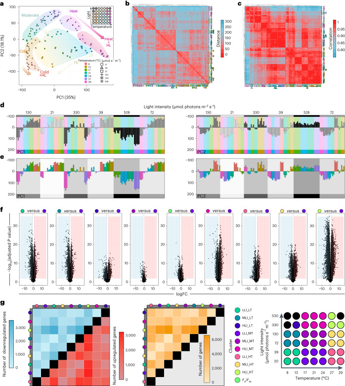
Fig. 2. Global profiles of environment-governed gene expression response.
a, PCA visualizing PC1 and PC2. Backgrounds were drawn to highlight our interpretation of the observed trends; samples are coded by colour (temperature) and symbols (irradiance in µmol photons m−2 s−1). Samples that did not yield usable RNA are indicated as grey dots in the top-right overview of the experimental setup. b, Visualization of Euclidean distances between samples via heat map, from red, zero distance, to blue, furthest distance (a distance of 300). c, Heat map of Spearman correlation between samples, from red, maximum correlation (1.0), to blue, least correlation (<0.8). The clusters were calculated via the Euclidean distance. d,e, PC1 and PC2 scrutinized using a small multiples method of light intensity (d) and temperature (e). In d, shades of grey correspond to different light intensities. In e, different colours represent different temperatures and were mapped with the same colours as a. To perform differential gene expression analysis, we divided the table into nine sectors (see scheme of the table); additionally, a tenth group was raised based on Fv/Fm < 0.5. Linear models were fitted for each gene and empirical Bayes statistics computed for DEGs by the limma package. In total, 37 comparisons were made. DEGs were defined as genes with an absolute fold change (FC) ≥2 and Benjamini–Hochberg-adjusted P value less than 0.01. f, Volcano plots of DEGs for nine selected comparisons based on the sectors and the Fv/Fm < 0.5 criterion. g, Heat maps of numbers of DEGs for all sector-based comparisons (blue, downregulation; red, upregulation; yellow, sum of up- and downregulated genes); grey bars label the first component (treatment) for calculating the contrasts (treatment versus control).

