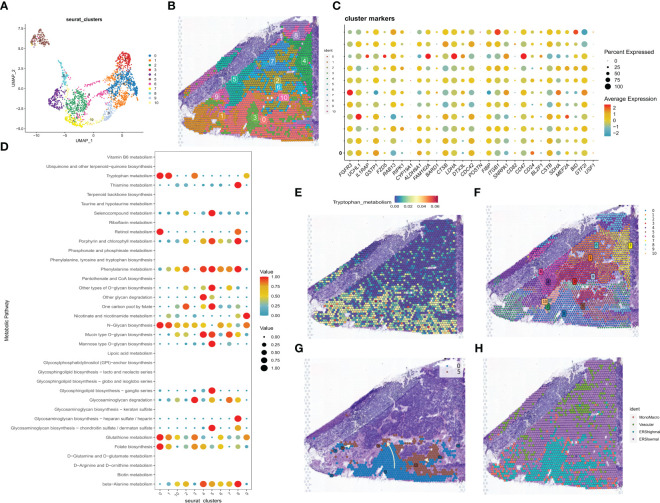
Figure 4.
correlation analysis of the spatial transcriptome. (A) UMAP plot showing the 11 clusters identified by stRNA-seq. (B) Spatial plot showing the 11 clusters identified by stRNA-seq. (C) Bubble plot presenting the expression intensity of exosome-related genes for different clusters. Red color represents high expression and blue color represents low expression. (D) Bubble plots presenting the metabolic intensities of different clusters. Red represents high expression, blue represents low expression. (E) The spatial plot of tryptophan metabolic intensity. (F) The spatial plot of 11 cellular clusters identified in python. (G) Spatial map showing the developmental trajectory of cluster 0 to cluster 5. (H) The distribution of different cell types in the spatial map was identified by the algorithm of RCTD.

