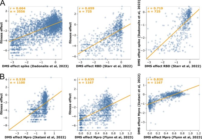
Figure 4.

Correlation of mutation-effect estimates with experimental deep mutational scanning measurements for (A) the full spike (Dadonaite et al. 2023) or its RBD (Starr et al. 2022b), and (B) Mpro (Flynn et al. 2023; Iketani et al. 2022a). Each point is an amino acid mutation, the orange line is a least-squares regression, and orange text in the upper left shows the number of mutations and Pearson’s correlation coefficient. Each subpanel shows a different set of mutations (depending on which mutations were measured in that experiment). See https://jbloomlab.github.io/SARS2-mut-fitness/dms_S_corr.html and https://jbloomlab.github.io/SARS2-mut-fitness/dms_nsp5_corr.html for plots that also show the Mpro dataset from (Flynn et al. 2022) and have various interactive options. The plots in this figure show the average of the multiple phenotypes measured in the deep mutational scanning of Starr et al. (2022b); see https://jbloomlab.github.io/SARS2-mut-fitness/dms_S_all_corr.html for each phenotype separately. This figure only shows mutations with at least 20 expected counts, which is higher than the threshold of 10 used in most of the rest of this paper (this threshold can be adjusted in the interactive plots).
