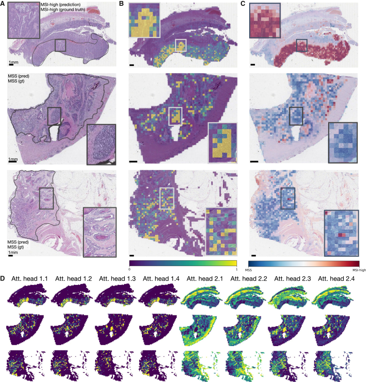
Figure 3.
Attention and class score visualization for better model interpretability
(A) Resection specimen from the external cohort YCR-BCIP. The three depicted slides are the same as in Echle et al.3 Tumor regions are outlined in black.
(B) Attention rollout per patch for our trained transformer-based feature aggregation model. Large values (yellow) signify a high contribution to the model’s prediction, small values (purple) a low contribution.
(C) MSI classification scores per patch, where MSI-high is the positive class and MS-stable is the negative class.
(D) The attention heatmaps from eight heads, four of the first and four of the second layer. The model weights are taken from the best-performing fold of the multi-centric training on all cohorts except YCR-BCIP.

