
Fig. 4.
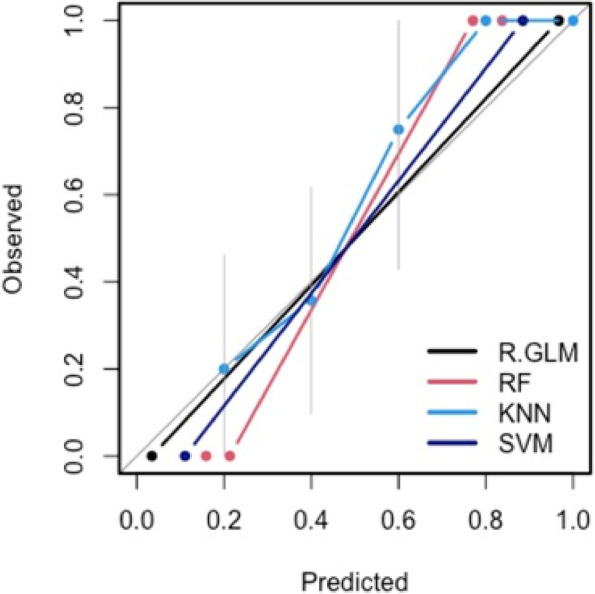
Model calibration curves with associated 95% confidence bands (grey). The y-axis represents the actual probability, and the x-axis represents the predicted probability of placenta accreta spectrum. Each curve corresponds to a predictive model and assesses the alignment between mean estimated model probabilities obtained from that model, and observed event rates within each risk group. Here the risk groups are defined with respect to the quintiles of the predicted probabilities from that model. The closer the lines are to the ideal grey line (45° line), the better the prediction accuracy of the model