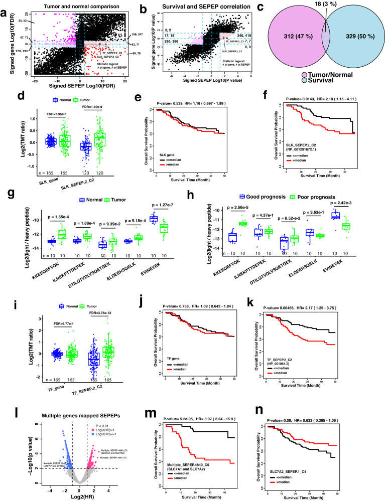
Fig. 6. Application of SEPepQuant to an HCC-TMT dataset.
a Scatter plot of tumor versus normal comparison results at gene and SEPEP levels. b Scatter plot of survival association results at gene and SEPEP levels. Colored dots in (a, b) are utilized to represent SEPEPs that exhibit a significant test result, while lacking a corresponding significance at the host gene level. In addition, the numbers within each area indicate the count of unique host genes and SEPEPs present in that particular region. c Overlap of genes showing significantly increased expression in tumors compared with normal samples as well as significant association with poor prognosis at the SEPEP level but not at the gene level. d Tumor versus normal comparisons based on SLK gene and SLK_SEPEP.2_C2 abundance, respectively. e, f Kaplan–Meier plots comparing overall survival for patients stratified by the median SLK gene-level abundance and median SLK_SEPEP.2_C2 abundance, respectively. g PRM abundance comparison of selected peptides between tumor and matched normal samples. h PRM abundance comparison of selected peptides between selected patients with poor and good prognosis. i Tumor versus normal comparisons based on TF gene and TF_SEPEP.2_C2 abundance, respectively. j, k Kaplan–Meier plots comparing overall survival for patients stratified by the median TF gene-level abundance and median TF_SEPEP.2_C2 abundance, respectively. l Associations between survival and multi-genes SEPEPs. m, n Kaplan–Meier plots comparing overall survival for patients stratified by the median Multiple_SEPEP.4840_C5 abundance and median SLC7A2_SEPEP.1_C4 abundance, respectively. For boxplots, P values were calculated using two-sided Student’s t test, the Benjamini and Hochberg method was used to adjust P values for multiple comparisons, centerline indicates the median, box limits indicate upper and lower quartiles, whiskers indicate the 1.5 interquartile range. For survival analysis, P values were calculated using Kaplan–Meier test. Source data are provided as a Source Data file. HR hazard ratio.

