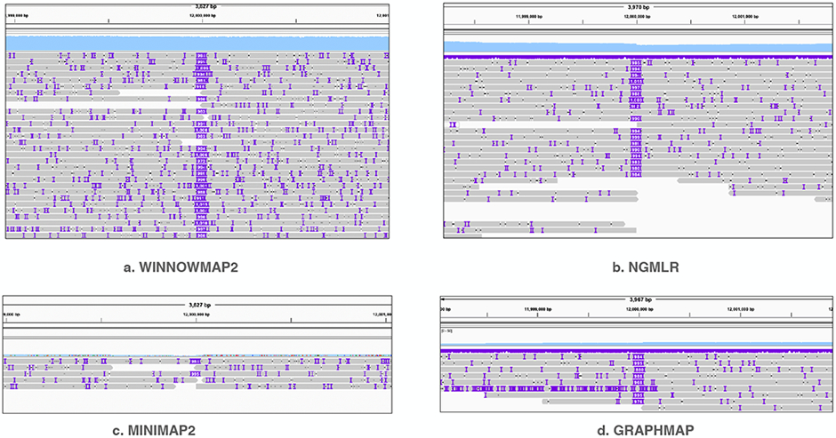
Figure 2:

Visualization of alignment pileup near the mutated bases of chromosome 8 by using IGV tool [47]. The sky-blue-colored track on top of each plot shows mapping-coverage using a uniform y-axis scale (0-50). The grey-colored line segments show individual primary read alignments. IGV uses purple markers to indicate presence of indels within read alignments. NGMLR, minimap2, graphmap show reduced coverage due to allelic bias whereas Winnowmap2 shows expected coverage in this region. Consistent large insertions in the middle of each plot are distinctly visible due to simulated SV.
