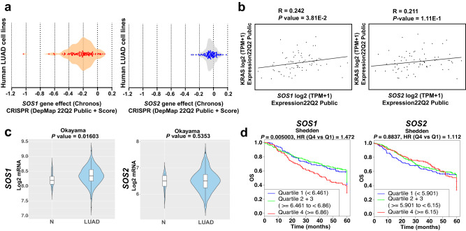
Fig. 8. In silico assessment of the functional relevance of SOS1 for human LUAD.
a hSOS1 and hSOS2 gene dependency score of human LUAD cell lines featured in the CRISPR library of the DepMap portal. b Evaluation of the correlation between hKRAS gene expression level and that of hSOS1 and hSOS2 in human LUAD cell lines gathered in the DepMap portal library. Pearson’s correlation (R) and P values are shown in each graph. c Violin plots comparing hSOS1 and hSOS2 gene between non-tumoral (N; cohort size: 20) and LUAD specimens (cohort size: 226) in the Cancertool Okayama dataset. The Y-axis represents the Log2-normalized gene expression (fluorescence intensity values for microarray data or, sequencing reads values obtained after gene quantification with RSEM and normalization using Upper Quartile in case of RNAseq). The white boxes represent the interquartile range of the data. Minima and maxima in the boxes indicate the first quartile and the third quartile, respectively, whereas the center indicates the median. The whiskers represent the upper and the lower adjacent values. Outside points (traditionally classified as mild and severe outliers) can be also observed. A Student t-test is performed in order to compare the mean gene expression between two groups. d Kaplan–Meier curves showing the overall survival (OS) of patient groups selected in the Cancertool Shedden dataset, according to the quartile expression of the hSOS1 or hSOS2 genes. Quartiles represent ranges of expression that divide the set of values into quarters. Quartile color code: Q1 (Blue), Q2 + Q3 (Green), Q4 (Red). Each curve represents the percentage (Y-axis) of the population that exhibits recurrence of the disease along time (X-axis, in months) for SOS1 or SOS2 expression distribution quartile. Vertical ticks indicate censored patients. Quartile color code: Q1 (blue), Q2 plus Q3 (green), Q4 (red).

