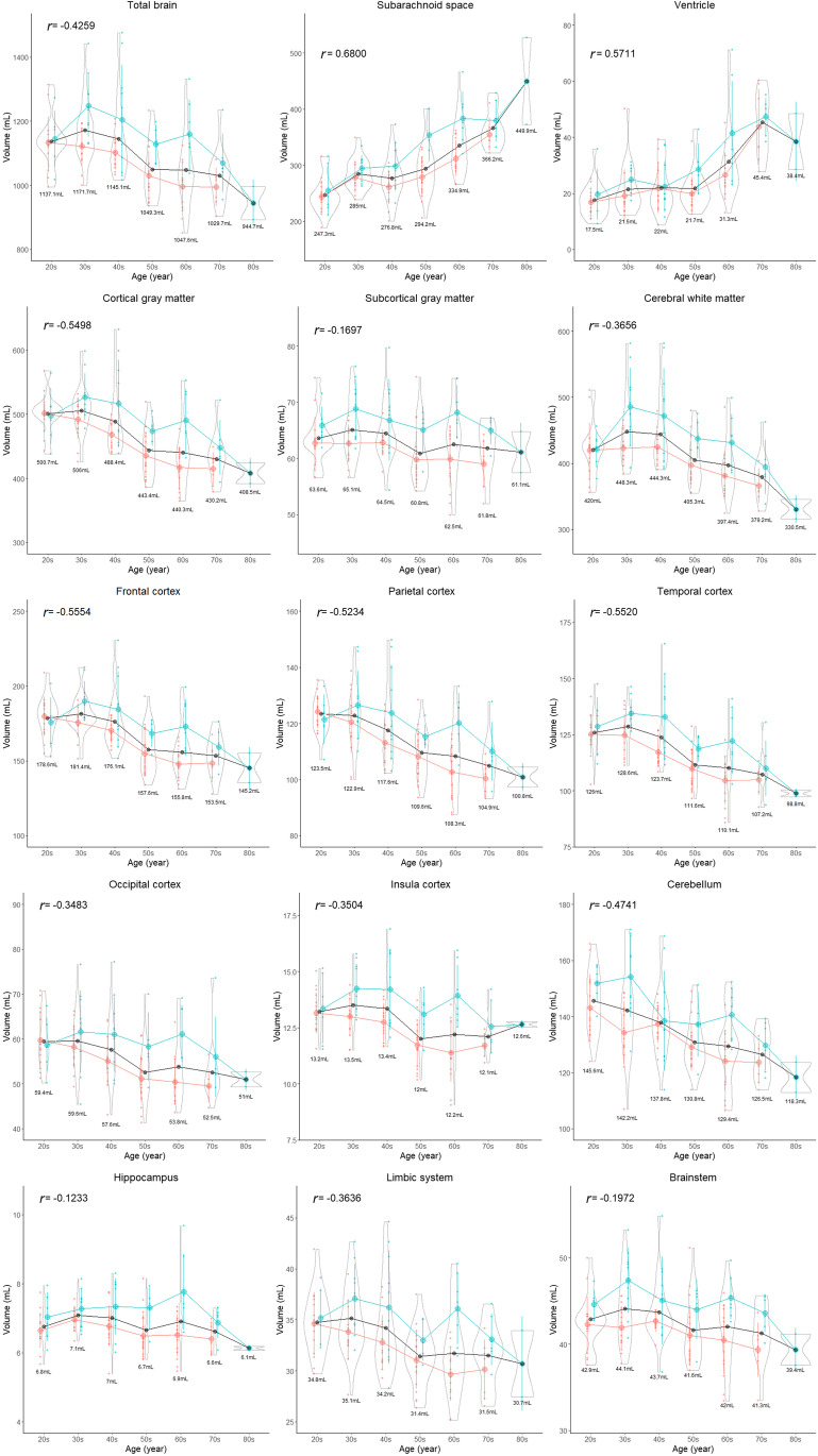
Fig. 5.
Segmented region volume. Each graph is a combination of violin plots for the distribution of the segmented volume and line graphs for the mean volume in each decade stratified by sex. Red indicates female, blue indicates male, and black indicates all. The red and blue vertical lines contain the volumes between the 25th and 75th percentiles. The mean volume in each decade is shown under the violin plot. The relationship between segmented volume and age in each region was examined using Pearson’s correlation coefficient (r)

