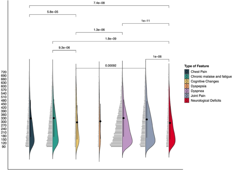
Fig. 6.
PASC sub-phenotype features temporal distribution. For each PASC sub-phenotype we report the number of features in each 30-day time window. The plot, which reports days on the y-axis, illustrates kernel densities on the right of each PASC sub-phenotype, mean and standard deviation (the points and the intervals over the violin plots), and jittered raw data points on the left. Temporal distributions of PASC features were compared by pairwise Wilcoxon test, with a Bonferroni correction; p-values for significant results (<0.05) are reported on the vertical lines that connect different PASC sub-phenotypes.

