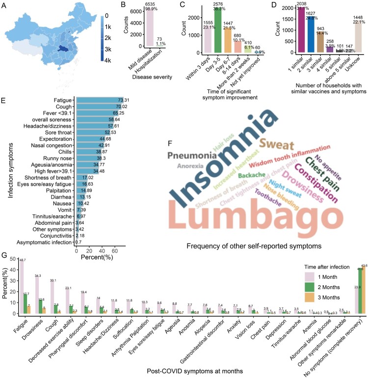
Figure 1.
Symptom distribution of positive participants. A: Map showing the provincial distribution of the participants in China. The top five provinces with the most participants were Hubei, Beijing, Anhui, Shanxi and Guangdong. B: Diagram showing the proportion of hospitalizations (severe COVID-19) of infected participants. C: Diagram showing the timing of when participants’ symptoms improved significantly. D: Diagram illustrating the proportion of infected individuals reporting similarities in symptoms and vaccination status with at least one family member, indicating the potential role of close family contact in contributing to the spread of the virus. E: Bar chart showing the symptom frequencies of infected subjects. F: Word frequency map showing the other symptoms most commonly reported by the infected participants. The data comes from symptom frequency statistics filled out by participants themselves. When participants feel that the symptom options in the questionnaire do not match their own situation, they can choose other options and supplement their own symptoms. G: Bar chart showing participants’ symptom frequencies at 1–3 months.

