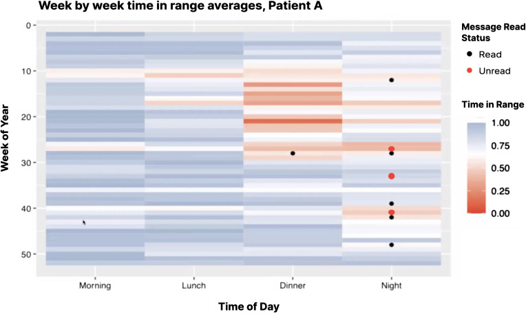
Figure 4.
Example visualization picturing average weekly time in range for a given patient over time, split by time of day. Messages sent by clinical team are also overlayed, and color coded by whether or not they were read by the patient. The purpose of this visualization is to provide a quick overview for whether or not a patient is responding to recommendations provided by the care team.

