
Figure 4.
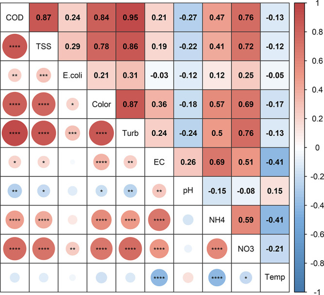
Heat map of the Pearson correlation coefficient and Welch’s t test p-value between each variable. Red colors denote a positive correlation, whereas blue represents a negative correlation. “*” = p ≤ 0.05, “**” = p ≤ 0.01, “***” = p ≤ 0.001, “****” = p ≤ 0.0001.