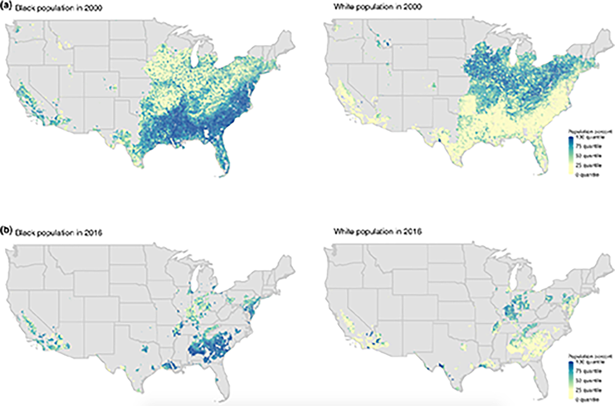
Figure 3. US ZCTAs with average concentration above 8 μg/m3 for the Black and white populations in 2000 and 2016:

The maps only show US ZCTAs with levels above 8 μg/m3 in (a) 2000 and (b) 2016. The maps on the left are color-coded based on the fraction of the Black population in ZCTAs, while the maps on the right are color-coded based on the white population fraction. For example on the left map in panel (a), the dark-blue and light-yellow colors correspond to ZCTAs with the largest and smallest Black population percentages of the total ZCTA population respectively in 2000, or equivalently where the Black population is over- and under-represented respectively in 2000. The left map of (a) reveals that almost half of the ZCTAs with levels above 8 μg/m3 in 2000 correspond to those where the Black population most lives (almost half of the map is dark-blue). However in 2016, ZCTAs that remained above 8 μg/m3 are only those that are dominated by the Black population (left map in panel b). In contrast, ZCTAs that still had above 8 μg/m3 in 2016 are mainly those where the white population is under-represented (right map in panel b). Videos 5–8 show the distribution of the different racial/ethnic groups across multiple ranges of concentrations in 2000 and 2016 respectively.
