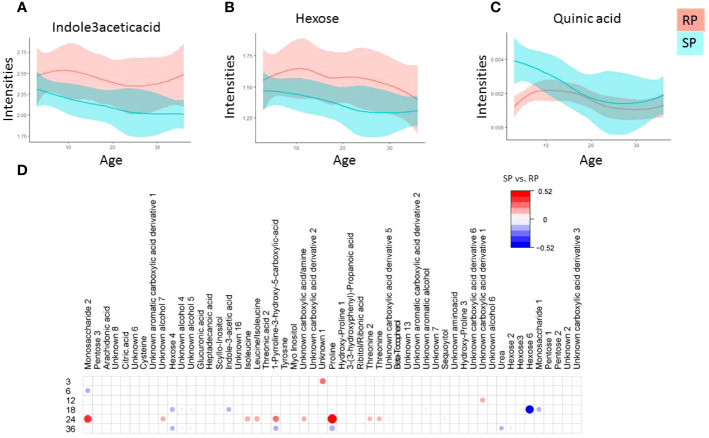
Figure 2.
Polar metabolite profiles in serum during the follow-up. (A-D) Local polynomial regression fitting (LOESS) curve plot of metabolite concentration over time for the two study groups. Blue, Slow Progressors, SP; red, Rapid Progressors. Solid line, mean value; shaded area, 95% CI. e) Age matched comparison of polar metabolite between SP and RP. The plot shows the most discriminating metabolites between the two study groups compared using multivariable linear model (metabolite ~ sex +case), where case indicate (SP vs. RP). Red and blue colors signify linear correlation coefficient up-, down-regulation SP vs. RP.

