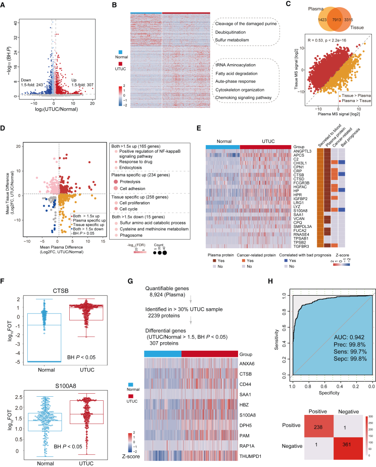
Figure 2.
Plasma proteome profiles differed between UTUC and normal samples
(A) Protein abundance differences between UTUC and normal plasma samples.
(B) Different pathways between UTUC and normal plasma samples.
(C) Spearman correlation between plasma and tissue proteomes.
(D) Fold changes of plasma and tissue proteins in UTUC and normal samples (left), and pathways enriched for respective specifically changed proteins (right).
(E) Heatmap showing the proteins that meet the screening criteria. Their presence in blood was annotated from HPA.
(F) Box plot showing plasma protein abundance of CTSB (BH P = 4.27E-7) and S100A8 (BH P = 8.25E-15). Boxplots show median (central line), upper and lower quartiles (box limits), 1.5× interquartile range (whiskers).
(G) (Top) Strategy for plasma signature proteins to distinguish between UTUC and normal samples. (Bottom) Heatmap of the selected proteins expressed in UTUC and normal plasma samples.
(H) ROC curve of plasma signature proteins in UTUC discovery cohort.

