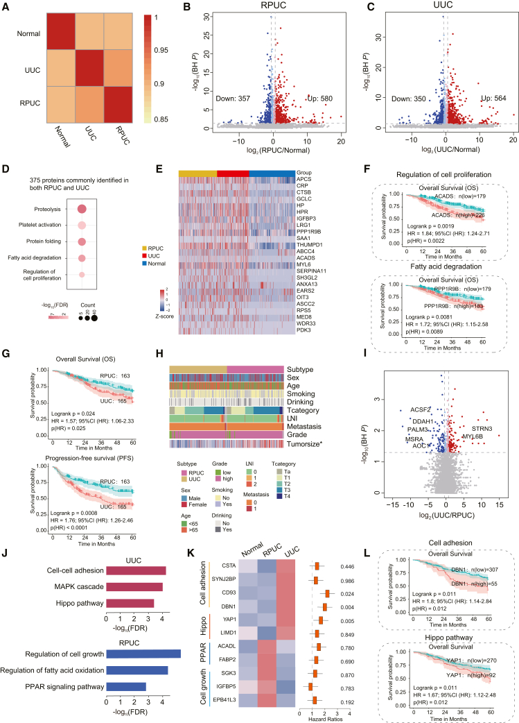
Figure 4.
Similarities and differences between RPUC and UUC
(A) Spearman correlation of plasma proteins among RPUC, UUC, and normal samples.
(B) Volcano plot showing protein abundance differences between RPUC and normal plasma samples.
(C) Volcano plot showing protein abundance differences between UUC and normal plasma samples.
(D) Pathway analysis of proteins commonly identified in both renal pelvis and ureter samples.
(E) Heatmap showing protein abundance differences between normal and UTUC samples.
(F) Overall survival (OS) analyses of UTUC patients with high or low levels of ACADS (top) or PPP1R9B (bottom) protein abundance in UTUC discovery cohort.
(G) OS and progression-free survival (PFS) analyses of RPUC versus UUC patients.
(H) The association of RPUC with UUC in terms of clinical information.
(I) Volcano plot showing protein abundances between RPUC and UUC.
(J) Pathway analysis of RPUC (blue) and UUC (red).
(K) (Left) Heatmap showing the protein abundance among normal, RPUC, and UUC. (Right) The hazard ratio of each protein.
(L) OS analyses of UTUC patients with high or low levels of DBN1 (top) or YAP1 (bottom) protein abundance in UTUC discovery cohort.

