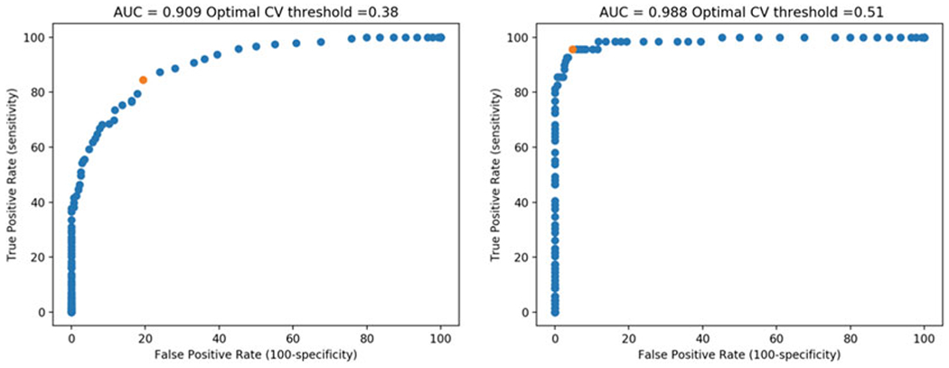
Fig. 2.

ROC curves generated from analyzing ROC_data.csv using ROC curve.py. The plot on the left incorporates all cells identified as having puncta, regardless of the confidence level; the plot on the right shows only cells with definite puncta. Red dots highlight the calculated optimal CVintensity thresholds
