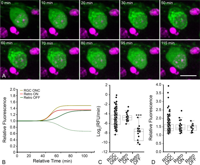
Fig. 4.
Ex vivo imaging shows some RGCs exhibit translocation followed by retrotranslocation. A Still images from a RGC that exhibited retrotranslocation during a live-cell imaging session (see supplementary video S2). The time stamp refers to the elapsed time from the initiation of the imaging session. DRAQ5 counterstaining was used to highlight nuclei. Scale bar = 10 µm. B Median curves of all data showing that “ON” rates (maximum linear slope) are equal between RGCs with stable translocation and retrotranslocating RGCs. The hashed green line shows the actual median curve of the OFF retrotranslocation data, while the solid green line is the same data that has been flipped on the vertical axis to better highlight the maximum rate compared to the ON rates. The “OFF” rate is slower implying a distinct mechanism driving the retrotranslocation. The complete set of curves for these cohorts is graphed in Supplemental Figure S3. Data used for RGCs with stable translocation of GFP-BAX is the same as that shown in Fig. 3. C Box and whisker plot of all rates. Each data point represents the maximum rate at a single mitochondrial locus (see Table 1). The “ON” rates of GFP-BAX translocation are the same comparing stable RGCs and RGCs that exhibit retrotanslocation (P = 0.21). The “OFF” rate of GFP-BAX in these cells, however, is significantly slower than both “ON” rates (***P < 0.0001, ANOVA). D Box and whisker plot of final relative fluorescence showing that stable cells and retrotranslocating cells accumulate similar levels of BAX, while the amount of BAX retrotranslocated is statistically similar to the amount of BAX that was originally translocated in these cells

