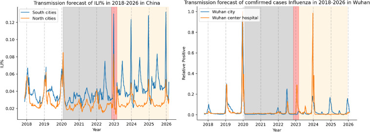
Fig. 5.
Forecasting ILI trends in mainland China and Wuhan using the SARIMA model. The graphs display the predicted transmission of ILI in mainland China (left) or Wuhan (right) from 2018–2026. The blue line corresponds to the South cities (left) or Wuhan City (right), while the orange line corresponds to the North cities (left) or the Central Hospital of Wuhan (right). A gray dashed line represents the boundary for each year, and the gray-shaded area indicates the NPIs period, while the red area represents the transitional period following the relaxation of the NPIs. The yellow area indicates the trend predicted by the SARIMA model for the next 3 years

