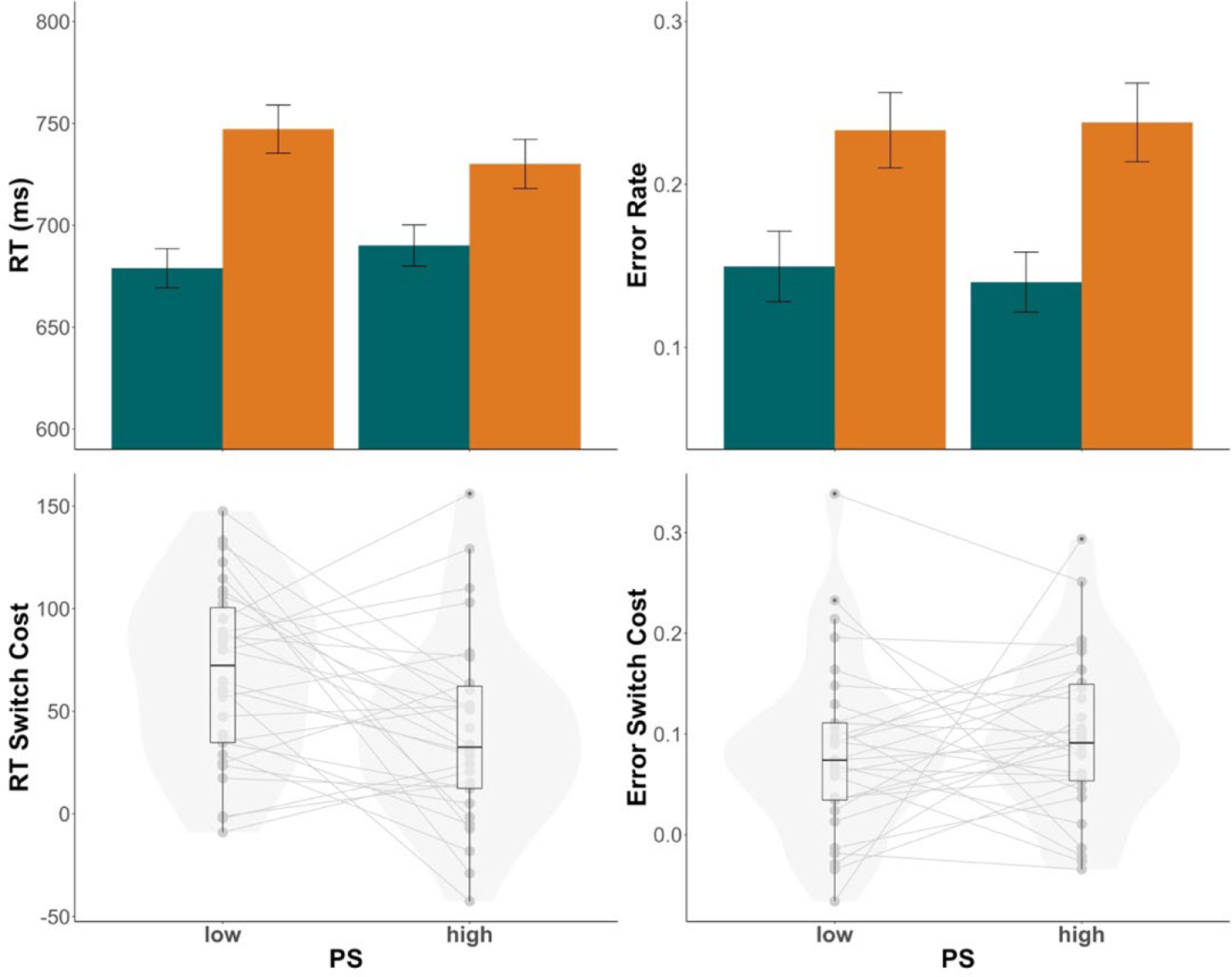
Figure 2.

Experiment 1 results. Top panels depict group mean RTs (top left) and error rates (top right) in low (30%) versus high (70%) proportion switch (PS) conditions with switch trials in orange and repeat trials in green. Bottom panels depict switch costs for RTs (bottom left) and error rates (bottom right), which were calculated as switch - repeat. Individual dots represent individual mean switch costs. Violin plots are overlaid to visualize the distribution of individual means. In the box plots, central lines depict group medians, box edges show the interquartile range (IQR), and the length of the whiskers mark 1.5 × IQR.
