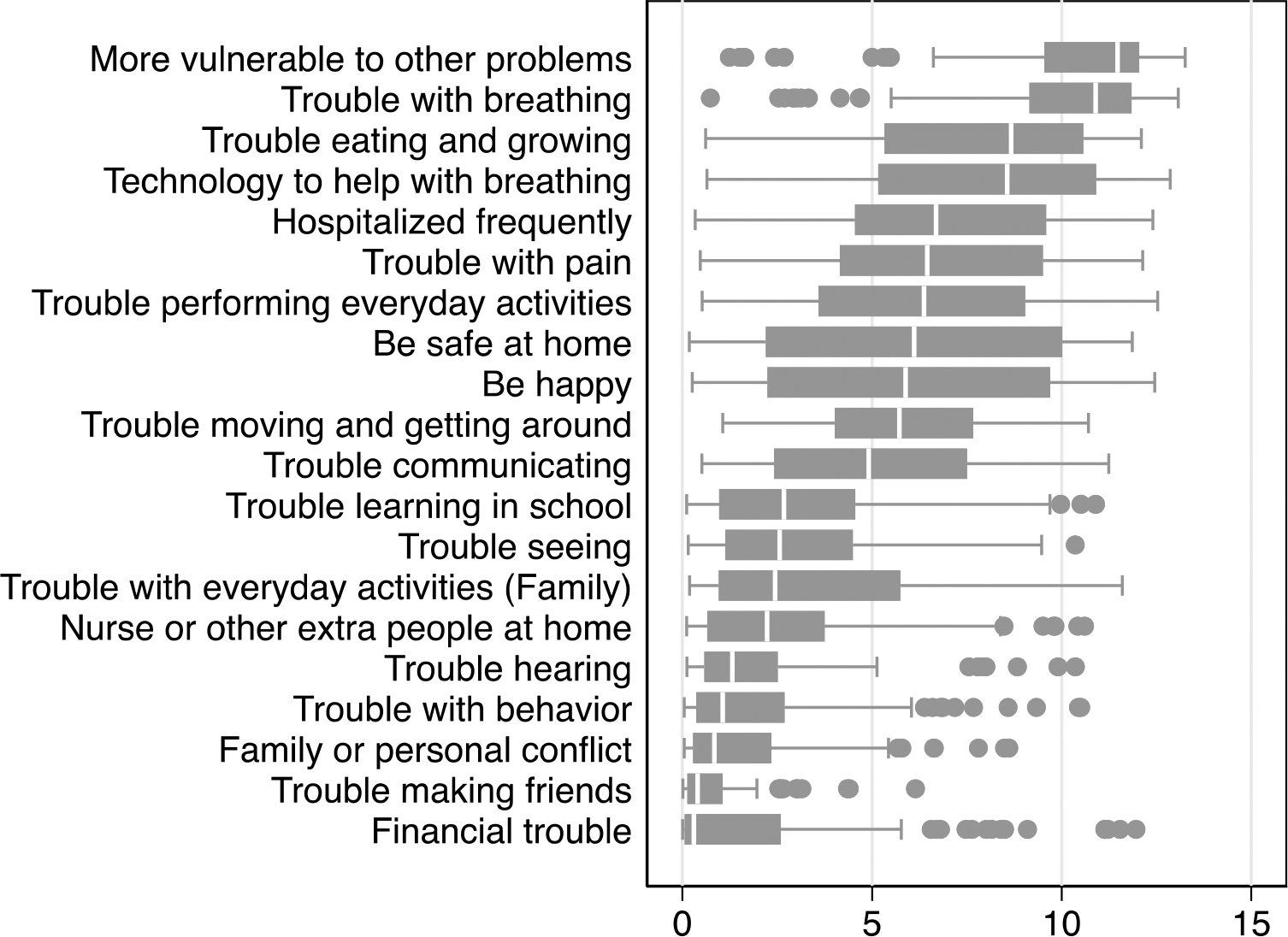
Figure 4—

Individual-Level Variation Across Outcome Importance Scores.
This graph presents the interquartile range of outcomes, which represents the spread of the middle half of the scores in each outcome. The line within each box represents the median, the left edge of the box represents the 25th percentile, and the right edge represents the 75th percentile of scores. The whiskers extending out of the box represents minimum and maximum scores, except for outliers (more than 1.5 interquartile range beyond the 25th and 75th quartiles), which are represented with point markers.
