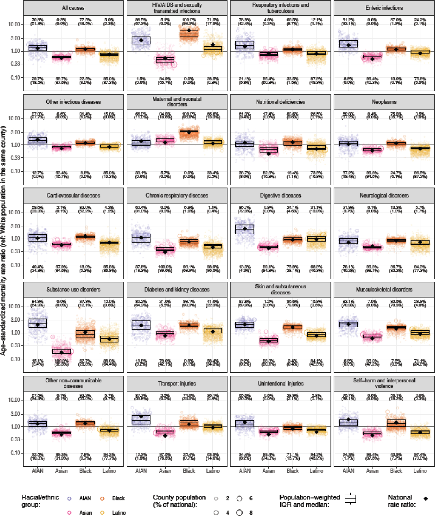
Figure 7: Estimated age-standardised mortality rate ratio compared with the White population residing in the same county in 2019 by cause, county, and racial–ethnic group.

Each circle corresponds to one county, and the size of the circle is proportional to the population of a given racial–ethnic group in that county. The boxes indicate the population-weighted median and interquartile range of the county-level mortality rate ratios—ie, a quarter of the population lives in counties where the mortality rate ratio is lower than the level indicated by the bottom of the box, another quarter of the population lives in counties where the mortality rate ratio is between the level indicated by the bottom of the box and the level indicated by the middle bar, and so on. The diamond indicates the national mortality rate. Numbers at the top of each panel indicate the percentage of counties with unmasked estimates where the mortality rate ratio is >1, with the percentage where this is statistically significant shown in parentheses. Similarly, numbers at the bottom of each panel indicate the percentages where the rate ratio is <1. Estimates have been masked for county and racial–ethnic groups with a mean annual population fewer than 1000 people because model performance declined notably below this threshold.
