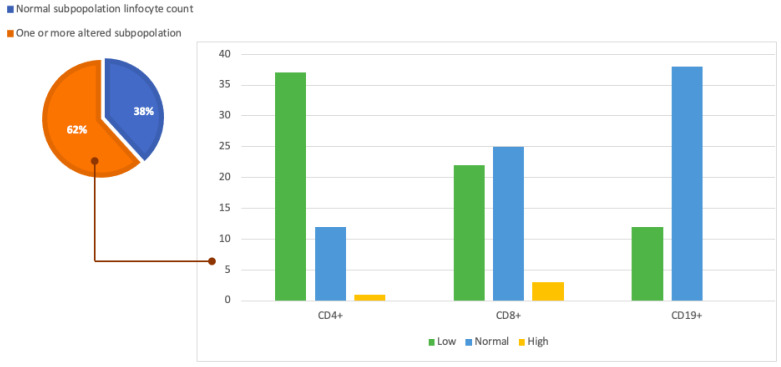
Figure 2.
Graphic representation of our study population and cytofluorometry results. The pie chart on the left shows the proportion of patients in the population under analysis with normal lymphocyte counts (38%) and the proportion of the population with one or more subpopulations with altered lymphocyte counts (62%). The histogram on the right analyzes this latter part of the population in more detail and shows the number of patients with altered lymphocyte subpopulations divided by CD4+, CD8+, and CD19+.

