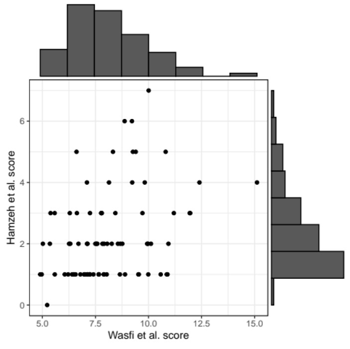
Figure 3.
Scatterplot representing the correlation between the two scores. Black points correspond to patients’ values for the two scores. Histograms summarizing the distribution of Wasfi et al. [24] score (x-axis of scatterplot) and Hamzeh et al. [25] score (y-axis) are reported on the horizontal and vertical axis, respectively.

