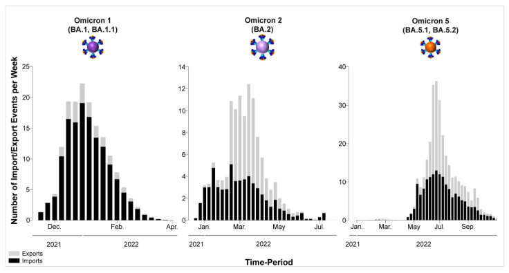
Figure 10.
This visual representation effectively conveys the temporal patterns of SARS-CoV-2 import and export activities involving Cyprus, offering insights into the dynamics of viral transmission and movement during the period under consideration. Each column in the graph corresponds to one week, with the width indicating the duration of that week and the height of each column representing the mean estimated total number of migration events (to or from Cyprus) occurring during that specific week. Exports from Cyprus are depicted in gray columns, while imports into Cyprus are shown in black columns. The y-axis represents the number of import/export events per week, quantifying the flow of SARS-CoV-2 to and from Cyprus. The x-axis represents time, showcasing the progression of weeks over the specified period.

