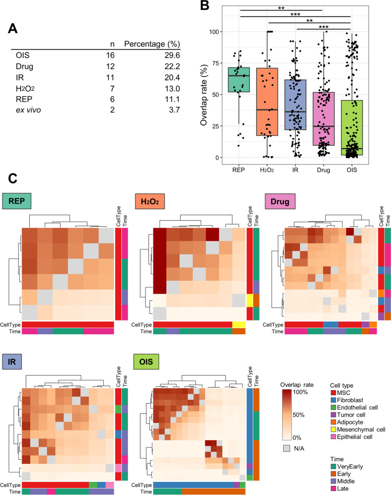
Fig. 3.
Similarity analysis among different stressor types. A The data are classified, and the number of protein lists obtained from senescent human cells is indicated. B A box plot displays the overlap rates for each stressor type. Statistical significance is denoted by asterisks (*p < 0.05, **p < 0.01, ***p < 0.001). C A heatmap depicts the overlap rates, with grey color indicating overlap rates calculated from the same protein lists. The color label positioned at the bottom and right side of the heatmap represents the characteristics of the data

